
Reading *Factfulness*: 4 Instincts, 4 Fixes from the Formulation Lab
- Published on
- Authors

- Name
- Huashan
- @herohuashan
Content: Before opening Hans Rosling's Factfulness, I went through the 13 quiz questions at the front of the book. The book says: "If you can get them all right, you probably have a correct view of the world."
I got 3 right. The other 10—all wrong.
Worse than random—even blind guessing gives you 33%, and I scored below that.
It doesn't feel great. Every question in the book says: most of what you think you know about the world is wrong.
But after finishing the book, I realized this "caught in the act" experience is worth far more than the dopamine hit of a feel-good read. A formulation scientist makes judgments under uncertainty every day—and if the underlying intuition of "what the real world looks like" is wrong, then the foundations I use to read data, forecast stability, and evaluate process routes may be built on a pile of illusions.
This post is what I wanted to write down after finishing Factfulness: the 4 instincts (my notes already listed the first 4, but the 4th I only sketched the harm categories—I didn't finish it; this post completes them), their countermeasures, and then one more section—where, as a formulation scientist, I drop these 4 instincts into my daily decisions and find they are worth far more than "knowledge."
Video Walkthrough
1. What the 13-question quiz actually measures
I don't remember all 13, but a few stand out:
- "What percentage of 1-year-olds in the world today have been vaccinated?" I picked 60%. The answer is 80%.
- "Where do most of the world's poorest people live?" Without overthinking it, I picked "South Asia / Africa." The answer is sub-Saharan Africa—but lower than most people's intuition suggests.
- "How has the share of the world population living in extreme poverty changed over the last 20 years?" I picked "basically unchanged." The answer is roughly halved (from ~29% in 1997 to ~9% in 2017).
On the second question, I had no information at all—I just guessed based on "map + color"—and that's exactly what Rosling calls the "Division instinct" at work: Africa and South Asia are stuck in my head as the "lagging countries" label, but as soon as you lay out the data, that "label-driven judgment" gut feel collapses immediately.
More importantly: behind every question, the author places real data from the Gapminder website (income per capita, child survival, energy use, vaccine coverage). Rosling was a public health scholar—none of his conclusions are moral lectures; they are charts that can be directly verified.

A scientist's favorite way to be convinced: give me data, give me the method, let me reproduce it myself.
2. 4 Instincts, 4 Fixes from the Formulation Lab
I'll finish the 4 instincts from the book first (my notes only wrote out the harm categories for the 4th—I'll complete them), then describe how I deal with them in a BASF formulation lab.
2.1 Avoiding the Division instinct
The Division instinct misleads us into treating smooth gradations as polarization, "different but compatible" as a split, and "common ground while reserving differences" as contradiction.
Rosling's simplest countermeasure: replace two levels with four.
Level 1: $1–2 per day income
Level 2: $2–8 per day income
Level 3: $8–32 per day income
Level 4: $32+ per day income
Lay out global GDP data from 1965–2017 and most people are "bunched" in Levels 2 and 3—there is simply no "developed vs. developing world" chasm. The vast majority of so-called "developing countries" actually crossed into Level 3 back in the 1980s.
Rosling used 1965–2017 global GDP and fertility data to falsify this binary intuition. But there's a key caveat he keeps flagging: watch out for the average-number trap—the moment you look only at averages, you fall into another illusion.
- Comparing averages: note the "average," but pay even more attention to the actual distribution. For instance, per-capita GDP looks hugely divergent, but the global majority's per-capita GDP clusters tightly around the median—not the kind of "polarization" averages suggest.
- Comparing extremes: if you only look at the highest and lowest, the world looks increasingly split; but if you plot the real distribution of the 80% in the middle, the "middle band" is thicker than you imagine.
- Look down, not up: many mistakes come from "looking down from above"—drawing conclusions from totals first. The right move is to look at the distribution first, then draw conclusions.
2.2 Avoiding the Negativity instinct
"The world is getting worse" is a major misconception—that's the Negativity instinct.
It comes from three mechanisms we don't notice:
- We're wired to react more strongly to bad things (an evolutionary legacy—bad things kill you).
- The past gets memory-polished; under the "good old days" filter, the bad things of the past are forgotten.
- News naturally selects the negative—"gradual progress isn't news."
Better and worse can coexist; good news isn't news; gradual progress isn't news; more bad news doesn't mean more bad things; beware romanticized history.
Once you understand this, you can make watching the news concrete in three operations:
- When you see a negative story, force yourself to ask "what's the matching positive data?"—Gapminder and Our World in Data almost always have the opposite-facing curve.
- When you see a judgment like "the past 5/10 years have gotten better/worse," first go look at the past 50–100 year curve—most indicators rise steadily on a century scale; what gets selected for broadcast is just the recent jitter.
- Watch out for "everything was great when I was young" nostalgia—that's a polished-up memory illusion.
2.3 Avoiding the Straight Line instinct
The Straight Line instinct comes from our ancestors' survival pressure in the hunter-gatherer era—seeing grass move and running the other way was a useful shortcut. But applied to today's world, it makes plenty of mistakes.
Rosling's counterexamples:
- Ebola's spread was exponential—it looks like nothing at first, then jumps an order of magnitude overnight. Straight-line forecasting gets smacked by exponentials.
- World population growth is slowing; the total number of children is barely growing—not an infinite rise, but a curve approaching a plateau.
- Women's years of schooling vs. fertility—not linear, but S-shaped.
More concretely, nature and human society together exhibit at least 4 curve shapes:
S curve: starts at 0, accelerates, approaches a ceiling (e.g., technology adoption, female schooling)
Slide curve: fast, then slow, then flat (e.g., new-drug sales, leveling off after early expansion)
Hump curve: rises then falls (e.g., early adopters in innovation diffusion, market lifecycle of a formulated product)
Exponential curve: slow, then very fast (e.g., epidemic spread, compound interest)
Before predicting, first ask what shape this curve is—don't pretend everything is a straight line.
2.4 The Fear instinct (this section I didn't finish before)
The Fear instinct drives us to overreact to three categories of risk:
1. Physical harm: violence from people, animals, sharp objects, natural environments
2. Loss of control: loss of control, loss of freedom, being suppressed
3. Contamination: infection or poisoning by invisible substances
Rosling's fix is direct—don't be misled by the visibility of the risk; calibrate with the data:
- The more visible a risk, the deeper it lodges in memory—but the actual incidence isn't necessarily high.
- In the modern world, the share of deaths from violence (war, homicide, terror) is declining, but people's fear of violence is rising because of the news.
- Deaths from "invisible dangers" (chronic disease, air pollution) far outnumber deaths from "visible dangers" (car crashes, violence)—but the former is almost never news.
Concrete practice: when you get a "fear-inducing" event, first ask three questions—
- What is the probability of this event (annually / per 10,000 people)?
- On a historical scale, is its damage footprint large or small?
- Among all causes of death / injury, where does it rank? (Only if it's in the top 5 is it worth genuinely worrying about.)
This is the most counter-intuitive of the 4 instincts, because it implies the fears you think you have are often wrong, and the more you keep "doom-scrolling the news," the further your judgments drift from the true risk distribution.
3. How these 4 instincts show up in the formulation lab
That wraps up the book. Here's the part that resonates most with me as a formulation scientist—these 4 instincts show up almost every day in a formulation lab, in subtler forms.
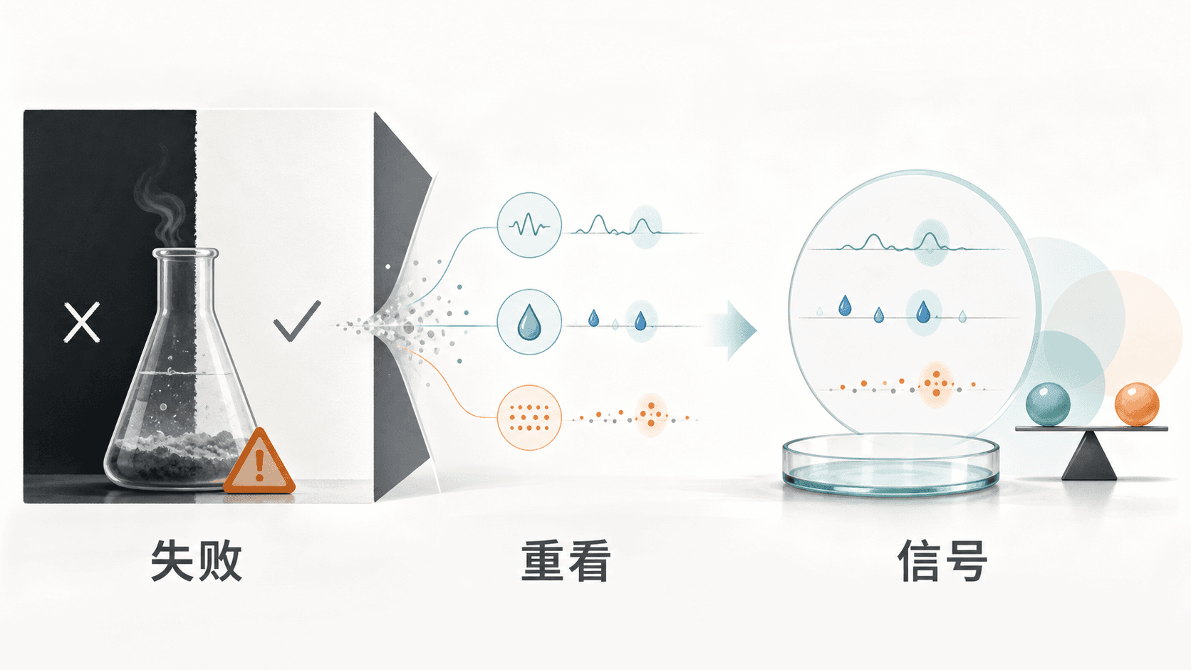
3.1 Division = "This formula: success vs. failure"
The biggest "Division" trap in a formulation lab is sorting formulas into "works vs. doesn't work."
But the real distribution is nothing like that—most formulas are "basically usable, but a few indicators are off." By one criterion it's a failure; swap criteria and it may be a partial win.
A safer framework is to replace "success / fail" with a "multi-indicator distribution":
- Any formula experiment should list at least 6 orthogonal indicators (thermal stability, foam, rheology, storage stability, pH drift, sensory evaluation)—don't just look at pass/fail.
- The true distribution across these 6 is usually uneven—some hit spec, some miss, some unexpectedly exceed spec. The whole picture isn't "divided in two," but a multidimensional map.
- Real interpretation means spotting which indicators over-performed (unexpected successes), which under-performed (need fixing), and which were fully expected (baseline confirmed). These 3 outcomes carry different value for formulation development.
A specific habit I've built: for any failed formula experiment, force myself to list 3 unprespecified indicators and re-look at the data. Most of the time you'll find the "Division" framing flattened some signal—and the signal itself got flattened, not just the conclusion.
3.2 Negativity = "Failures spread further than successes"
There's a counter-intuitive phenomenon in a formulation lab: "the formula failed" is more worth talking about than "the formula worked."
The reason is the mirror image of the Negativity instinct—success gets attributed to "of course," while failure gets analyzed seriously. So the real valuable knowledge often hides inside the negative experience.
I have a rule for my weekly lab report: if I only write one "why this formula is good," it's a press release; if I write 3 "why this formula is bad," that's the real technical accumulation.
That's also why Gapminder-like tools can be repurposed inside a formulation lab—instead of looking at the time curve for "successful formulas," look at why a superseded old formula got superseded. The thing that got replaced exposes the real process constraints.
3.3 Straight Line = "The shape of the scaling curve matters more than the scaling multiple"
Scale-up (lab → pilot → plant) is the daily engineering problem for a formulation scientist, and the most easily misled step by Straight Line thinking.
The most common failures I've seen:
- Stirrer speed from 200 rpm scaled to 1500 rpm: you think it's a 7.5× scale-up, but it's actually nonlinear— shear rate is S-shaped or logarithmic for certain processes.
- Addition time from 30 min scaled to 8 h: you think it's a 16× extension, but the underlying reaction/crystallization kinetics may be exponentially sensitive.
My default move now: for any "linear scale-up" assumption, force yourself to draw 2 curves—one is the real curve (data points + fit), the other is the straight-line prediction (dashed). The moment those two lines diverge, that curve isn't straight—and the assumption needs to be re-evaluated.
This is the most direct, most valuable tool among the 4 instincts for me—it's caught "just scale it linearly" proposals cold in process review meetings.
3.4 Fear = "The most dangerous formula risks are usually the ones that don't look dangerous"
The classic Fear instinct traps inside a formulation lab:
- Known acute toxicity: everyone is alert, all SOPs spell it out. What actually causes accidents and recalls is the chronic, low-dose, invisible risk—e.g., degradation products from a raw material under long-term storage, side reactions of an additive under humidity swings, cumulative effects of solvent residues.
- "Odd but rare" events get reported loudly: say, a color anomaly in a certain batch, but over the long term, the correlation between color anomalies and performance issues is low.
- "Controllable but invisible" processes: say, cumulative micro-oxidation at one step, which is actually the real source of most batch-to-batch variation.
Concrete practice: for any process change, first ask three questions—
- Is this change captured by any measurable indicator? (color, odor, pH, rheology, post-storage drift...)
- If there is no orthogonal measurable indicator, it's an "invisible danger"—prioritize it; don't defer it.
- Is its impact cumulative or one-shot? (Cumulative is far more dangerous than one-shot, because the Fear instinct is sensitive to single events and blind to cumulative ones.)
This one, after I finished the Fear chapter, immediately reshuffled my SOP priorities: I used to put "visible acute risk" first; now I put "invisible cumulative risk" on par with acute risk.
4. 4 Instincts, distilled into a "daily reminder"
After reading, I left myself a very simple reminder (stuck on the first page of my lab notebook):
Factfulness 4 reminder (once a day, on any data-driven judgment):

1. Did I divide? — Did I look at the real distribution, not the average?
2. Did I think negatively? — Better and worse coexist; check 50-year curves.
3. Did I think in straight lines? — Draw 2 curves; assume S / slide / hump / exponential.
4. Did I give in to fear? — Check whether the "invisible danger" matters more.
For any piece of judgment you read, once you've asked these 4 questions—often an intuition that seemed to hold collapses.
That's the most counter-mainstream thing about Factfulness: it doesn't teach you new knowledge; it makes you make fewer mistakes.
References
- Hans Rosling, Factfulness: Ten Reasons We're Wrong About the World—and Why Things Are Better Than You Think (2018)
- Gapminder.org (the data-visualization site Rosling founded; all 13 questions and global trend data are available)
- Our World in Data (long-scale global data, free and open; backs the "50-year curve" section)
Related Posts
Lab Automation Has Three Floors: Hardware, Data, Decisions - Most Teams Get Stuck on the Second
Hardware automation only solves the "hands" problem. Field notes on data and decision automation in a formulation lab: where the manual bottlenecks actually are, how I built the data pipeline and anomaly flagging, the IT pitfalls, and how much programming a chemist really needs.
"RIA Reading Method" Reading Notes: How to Build a Knowledge System Through Active Learning
Automating a Formulation Lab: From 10 Samples a Day to 45
A formulation scientist's field report on building a high-throughput lab - how the three modules were designed, the full HLD salt scan workflow, the honest efficiency ledger, the pitfalls, and why the endpoint of automation is AI but the starting point must be standardization.